Publication Figure Preparation Workflow
Goal
This page shows one complete EasyPlot workflow for building a publication-ready multi-panel figure in a regular MATLAB script.
The tutorial follows the same order you should use in practice:
set up a clean script,
define the layout,
draw data on named axes,
lock the scales and labels,
add only the annotations you need,
refine spacing,
crop and export.
What EasyPlot changes and what stays the same
When you use EasyPlot well, you do not stop writing normal MATLAB plotting commands. The main change is this:
EasyPlot controls figure creation, axes creation, layout, relative placement, and export.
Standard MATLAB plotting commands still draw the data.
The first argument of each plotting command should usually be an EasyPlot axis handle.
In practice, the pattern is:
create figure and axes with EasyPlot,
plot with
plot(ax, ...),scatter(ax, ...),imagesc(ax, ...), and similar calls,refine layout and annotations with EasyPlot,
crop and export at the end.
How to read this page
Treat the tutorial like a recipe. For each step:
read the short explanation first,
inspect the code block,
use the notes to understand what each line is doing,
then adapt the same pattern to your own data.
Practical rules before you start
Build the layout first. Do not start by plotting into random axes and fixing geometry later.
Keep one long linear script while you are authoring the figure.
Attach every plot to an explicit axis handle.
Set labels, ticks, limits, and color limits explicitly.
Add legends, colorbars, scalebars, and panel labels only after the main layout already works.
Inspect the rendered figure after every important change.
Step 1: Start with a clean script
Begin with a small setup block that makes the figure reproducible and easy to rerun.
root = fileparts(fileparts(mfilename('fullpath')));
figureOutDir = fullfile(root, 'Figure');
if ~exist(figureOutDir, 'dir'), mkdir(figureOutDir); end
assert(~isempty(which('EasyPlot.figure')), 'EasyPlot not found on MATLAB path');
rng(7);
fig = EasyPlot.figure('Visible', 'on');
What each line does
figureOutDir = fullfile('./Figure');defines the export folder used by the example.if ~exist(figureOutDir, 'dir'), mkdir(figureOutDir); endcreates that folder only when it is missing.assert(~isempty(which('EasyPlot.figure')), ...)fails early if EasyPlot is not on the MATLAB path.rng(7);fixes the random seed so the example looks the same every time.fig = EasyPlot.figure('Visible', 'on');creates a visible EasyPlot figure so you can inspect the layout while editing.
Why this step matters
A stable setup block saves time later. You can rerun the figure repeatedly without hidden state, missing folders, or path confusion.
Step 2: Build the layout before plotting
Create the geometry first. Once the panel layout is fixed, plotting and labeling become much easier.
ax_grid = EasyPlot.createGridAxes(fig, 2, 2, ...
    'Width', 2.8, ...
    'Height', 2.35, ...
    'MarginLeft', 0.95, ...
    'MarginBottom', 1.0, ...
    'MarginTop', 0.5, ...
    'MarginRight', 0.55, ...
    'FontSize', 7);
EasyPlot.set(ax_grid{1,1}, 'XAxisVisible', 'off');

ax_profile = EasyPlot.createAxesAgainstAxes(fig, ax_grid{1,2}, 'right', ...
    'Width', 0.8, ...
    'Height', 2.35, ...
    'MarginLeft', 0.45, ...
    'MarginRight', 1.25, ...
    'FontSize', 7, ...
    'YAxisVisible', 'off');
ax_top = ax_grid(1,:);
ax_bottom = ax_grid(2,:);
ax_heatmap_group = {ax_grid{1,2}, ax_profile};
What each line does
EasyPlot.createGridAxes(...)creates the main 2-by-2 panel grid.'Width'and'Height'set the panel size explicitly instead of relying on defaults.'MarginLeft','MarginBottom','MarginTop', and'MarginRight'reserve space for labels and keep the figure readable after cropping.'FontSize', 7applies the compact publication font size used throughout the example.EasyPlot.set(ax_grid{1,1}, 'XAxisVisible', 'off');hides the signal-panel x-axis early so that panel can be presented with a scalebar instead of a full x-axis.EasyPlot.createAxesAgainstAxes(...)adds a narrow profile axis attached to the heatmap.'YAxisVisible', 'off'removes a redundant y-axis from that profile panel.ax_top = ax_grid(1,:);groups the top row so shared x formatting can be applied in one call.ax_bottom = ax_grid(2,:);groups the bottom row for spacing adjustments later.ax_heatmap_group = {ax_grid{1,2}, ax_profile};groups the heatmap and profile because they share the same trial axis.
Why this step matters
Most publication figures become cleaner when the panel relationships are defined before any data are drawn.
Practical layout advice
Use bigger margins than you think you need when labels or colorbars will appear later.
Group related axes early. That makes shared labels, shared limits, and row/column moves much easier.
If one panel is conceptually attached to another, build it with
createAxesAgainstAxesrather than guessing raw positions.
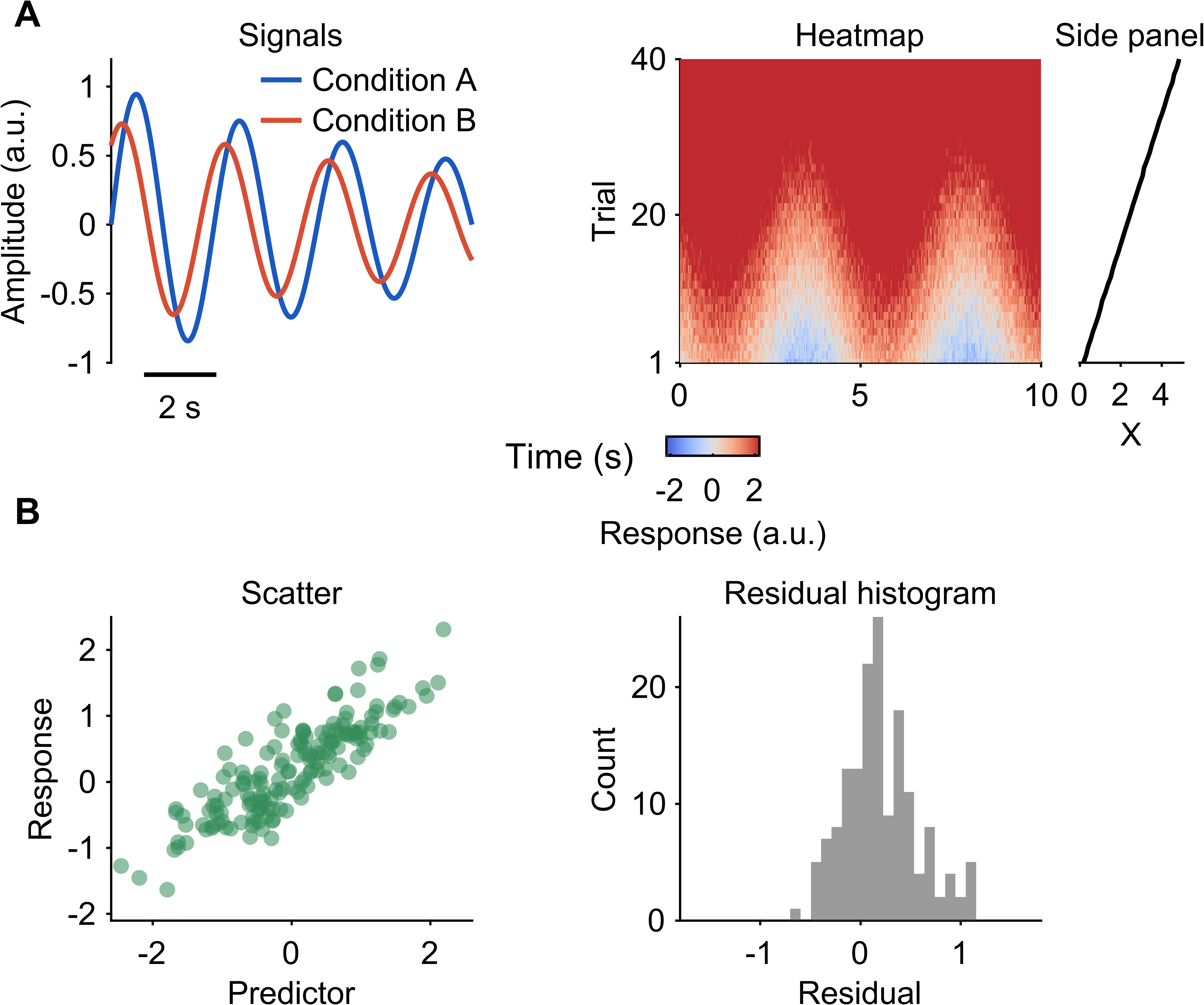
Step 3: Plot on named EasyPlot axes
Now draw the data. Standard MATLAB plotting functions stay readable as long as every call targets a specific EasyPlot axis.
t = linspace(0, 10, 300);
signal_a = sin(2*pi*0.35*t) .* exp(-0.08*t);
signal_b = 0.75*cos(2*pi*0.35*t - 0.7) .* exp(-0.08*t);
h_a = plot(ax_grid{1,1}, t, signal_a, '-', 'Color', [0.10, 0.35, 0.75], 'LineWidth', 1.1);
h_b = plot(ax_grid{1,1}, t, signal_b, '-', 'Color', [0.85, 0.30, 0.20], 'LineWidth', 1.1);

trial_idx = 1:40;
response_map = sin(2*pi*0.22*t) + 0.12*trial_idx';
response_map = response_map + 0.25*randn(numel(trial_idx), numel(t));
imagesc(ax_grid{1,2}, t, trial_idx, response_map);

scatter_x = randn(160, 1);
scatter_y = 0.65*scatter_x + 0.35*randn(160, 1) + 0.2;
scatter(ax_grid{2,1}, scatter_x, scatter_y, 12, [0.20, 0.55, 0.35], 'filled', ...
    'MarkerFaceAlpha', 0.55, 'MarkerEdgeColor', 'none');

residual = scatter_y - 0.65*scatter_x;
histogram(ax_grid{2,2}, residual, 18, ...
    'FaceColor', [0.35, 0.35, 0.35], ...
    'EdgeColor', 'none');

profile_trials = mean(response_map, 2);
plot(ax_profile, profile_trials, trial_idx, 'k-', 'LineWidth', 1.0);
What each line does
t = linspace(0, 10, 300);creates a shared time vector for the top row.signal_a = ...andsignal_b = ...build two example traces.h_a = plot(ax_grid{1,1}, ...)draws the first line on the first panel and stores its handle for the legend.h_b = plot(ax_grid{1,1}, ...)draws the second line on the same panel.trial_idx = 1:40;defines the trial axis for the heatmap.response_map = ...creates the matrix that will be shown as an image.imagesc(ax_grid{1,2}, ...)draws the heatmap on the second top panel.scatter(...)draws the bottom-left panel directly with MATLAB while EasyPlot still controls the layout.histogram(...)fills the bottom-right panel with the residual distribution.profile_trials = mean(response_map, 2);reduces the heatmap to one summary profile.plot(ax_profile, ...)draws that profile in the narrow companion panel.
Why this step matters
EasyPlot does not need to replace every plotting primitive. It manages the figure and axes; MATLAB drawing commands provide the marks.
Common plotting patterns in EasyPlot scripts
These are the practical patterns you will use again and again:
% line plot
plot(ax, x, y, 'k-', 'LineWidth', 1.2)

% scatter plot
scatter(ax, x, y, 18, color, 'filled', 'MarkerFaceAlpha', 0.6)

% heatmap or image-like data
imagesc(ax, x, y, value_map)
EasyPlot.set(ax, 'YDir', 'normal')

% histogram
histogram(ax, values, 20, 'FaceColor', [0.4, 0.4, 0.4], 'EdgeColor', 'none')

% bar plot
bar(ax, categories, values, 'FaceColor', [0.3, 0.5, 0.8])

% contour plot
contour(ax, x_grid, y_grid, z_map, 8, 'LineColor', 'k')
Practical plotting rules
Always pass the axis handle as the first argument.
Keep colors, line widths, marker sizes, and transparency readable at final export size.
Store handles when the object will later be used for a legend or moved annotation.
If a plot looks crowded, solve the layout first before shrinking the font.
Step 4: Make scales and labels explicit
After plotting, lock the shared limits, ticks, and labels so the reader can compare panels quickly.
EasyPlot.set(ax_grid{1,2}, 'YDir', 'normal');
EasyPlot.setXLim(ax_top, [0, 10]);
EasyPlot.setXTicksAndLabels(ax_top, [0, 5, 10], {'0', '5', '10'});
EasyPlot.setGeneralXLabel(ax_top, 'Time (s)');
EasyPlot.setYTicksAndLabels(ax_heatmap_group, [1, 20, 40], {'1', '20', '40'});
EasyPlot.setYTicksAndLabels(ax_profile, [1, 20, 40], {'', '', ''});
EasyPlot.setYLim(ax_heatmap_group, [1, 40]);

xlim(ax_grid{2,1}, [-2.6, 2.6]);
ylim(ax_grid{1,1}, [-1.0, 1.2]);
ylim(ax_grid{2,1}, [-2.1, 2.5]);
xlim(ax_grid{2,2}, [-1.8, 1.8]);
ylim(ax_grid{2,2}, [0, 26]);
xlim(ax_profile, [min(profile_trials)-0.2, max(profile_trials)+0.2]);
xlabel(ax_profile, 'X', 'FontSize', 7);
title(ax_profile, 'Side panel', 'FontSize', 7);

ylabel(ax_grid{1,1}, 'Amplitude (a.u.)', 'FontSize', 7);
ylabel(ax_grid{1,2}, 'Trial', 'FontSize', 7);
xlabel(ax_grid{2,1}, 'Predictor', 'FontSize', 7);
ylabel(ax_grid{2,1}, 'Response', 'FontSize', 7);
xlabel(ax_grid{2,2}, 'Residual', 'FontSize', 7);
ylabel(ax_grid{2,2}, 'Count', 'FontSize', 7);

title(ax_grid{1,1}, 'Signals', 'FontSize', 7);
title(ax_grid{1,2}, 'Heatmap', 'FontSize', 7);
title(ax_grid{2,1}, 'Scatter', 'FontSize', 7);
title(ax_grid{2,2}, 'Residual histogram', 'FontSize', 7);
What each line does
EasyPlot.set(ax_grid{1,2}, ‘YDir’, ‘normal’) fixes the heatmap reading direction.
EasyPlot.setXLim(ax_top, [0, 10]) gives both top-row panels the same time range.
EasyPlot.setXTicksAndLabels(ax_top, …) applies matching tick positions and labels across the top row even though the line panel hides its axis line.
EasyPlot.setGeneralXLabel(ax_top, ‘Time (s)’) creates one shared x label for the top row.
EasyPlot.setYTicksAndLabels(…) keeps the heatmap and profile aligned on the same trial positions.
EasyPlot.setYLim(…) forces the two trial-based panels to show the same vertical range.
xlim(…) and ylim(…) define the visible ranges explicitly for the signal, scatter, histogram, and attached profile panels.
xlabel(ax_profile, ‘X’) and title(ax_profile, ‘Side panel’) label the attached summary axis explicitly.
ylabel(…) and xlabel(…) tell the reader exactly what each main panel shows.
title(…) gives each panel a short descriptive heading.
Why this step matters
A figure becomes much easier to read when ranges, ticks, and labels are chosen intentionally instead of inherited from defaults.
Practical labeling advice
Shared labels usually read better than repeated labels on every panel.
Titles should be short; use labels and captions for detailed meaning.
Tick locations should help comparison, not simply mirror MATLAB defaults.
Heatmaps almost always need explicit color limits if they will be compared to other panels.
Step 5: Add only the annotations the reader needs
Once the data panels are stable, add compact annotations that improve interpretation without crowding the page.
h_legend = EasyPlot.legend(ax_grid{1,1}, {'Condition A', 'Condition B'}, ...
    'selectedPlots', [h_a, h_b], ...
    'location', 'northeast', ...
    'lineLength', 0.3, ...
    'fontSize', 7);
EasyPlot.setCLim(ax_grid{1,2}, [-2.2, 2.2]);
EasyPlot.colormap(ax_grid{1,2}, EasyPlot.ColorMap.Diverging.coolwarm, ...
    'zeroCenter', 'on', 'zeroPosition', 0);
h_colorbar = EasyPlot.colorbar(ax_grid{1,2}, ...
    'Location', 'southoutside', ...
    'Label', 'Response (a.u.)', ...
    'Height', 0.16, ...
    'Width', 0.72, ...
    'MarginBottom', 0.95, ...
    'FontSize', 7);
h_scalebar = EasyPlot.scalebar(ax_grid{1,1}, 'X', ...
    'location', 'southwest', ...
    'xBarLength', 2, ...
    'xBarRatio', 1, ...
    'xBarLabel', '2 s', ...
    'fontSize', 7, ...
    'fontWeight', 'normal');
h_marks = EasyPlot.markAxes(fig, ax_grid, {'A', 'B', 'C', 'D'}, ...
    'fontName', 'Arial', ...
    'fontSize', 8, ...
    'fontWeight', 'bold');
What each line does
EasyPlot.legend(…) builds the signal legend from the stored line handles and anchors it in the signal panel.
EasyPlot.setCLim(…) fixes the heatmap color range before the colorbar is added.
EasyPlot.colormap(…) applies a diverging colormap centered at zero.
EasyPlot.colorbar(…) attaches a layout-aware colorbar to the heatmap.
EasyPlot.scalebar(…) adds a compact time reference to the signal panel.
EasyPlot.markAxes(…) adds panel labels for the four main panels.
Why this step matters
Legends, colorbars, scalebars, and panel labels should support the figure, not dominate it. Add them after the main layout is already working.
Practical annotation advice
A legend should sit in stable empty space and be moved only after the final panel geometry is fixed.
A colorbar should be attached to the panel it explains and should not crowd nearby titles or labels.
A scalebar is often better than full axes when the panel is meant to feel compact.
Panel marks should be consistent in font, weight, and offset.
Step 6: Refine spacing manually
The final readability pass is usually a sequence of small relative moves.
EasyPlot.move(ax_grid(:,2), 'dx', 0.10);
EasyPlot.move(ax_bottom, 'dy', -0.45);
EasyPlot.align(ax_profile, ax_grid{1,2}, 'bottom');
EasyPlot.place(ax_profile, ax_grid{1,2}, 'right');
EasyPlot.move(ax_profile, 'dx', -0.70);
EasyPlot.move(h_colorbar, 'dy', -0.02);
EasyPlot.move(h_legend, 'dx', 0.3, 'dy', 0.2);
EasyPlot.move(h_scalebar, 'dx', 0.12, 'dy', -0.2);
EasyPlot.move(num2cell(h_marks), 'dx', 0.08, 'dy', 0.02);
What each line does
EasyPlot.move(ax_grid(:,2), ‘dx’, …) opens extra space for the right column.
EasyPlot.move(ax_bottom, ‘dy’, …) separates the bottom row from the top row.
EasyPlot.align(ax_profile, ax_grid{1,2}, ‘bottom’) matches the profile panel to the heatmap baseline.
EasyPlot.place(ax_profile, ax_grid{1,2}, ‘right’) keeps the profile panel attached to the heatmap.
EasyPlot.move(ax_profile, ‘dx’, …) opens a readable gap between those two panels.
EasyPlot.move(h_colorbar, …), EasyPlot.move(h_legend, …), and EasyPlot.move(h_scalebar, …) fine-tune annotation positions after the figure is visible, including lifting the legend away from the traces and dropping the scalebar below the hidden x-axis.
EasyPlot.move(num2cell(h_marks), …) gives all panel labels one consistent final offset.
Why this step matters
This is where a working figure becomes a polished figure. Small relative moves are easier to maintain than hand-editing raw positions.
What to inspect during refinement
Inspect these items after every rerender:
axes positions and panel balance,
row and column intervals,
legend placement,
colorbar position and label spacing,
title and label overlap,
clipping after cropping,
overall visual balance.
Typical fix order
fix panel spacing,
fix annotation positions,
fix clipping,
only then shorten labels or change font sizes.
Step 7: Crop and export at the end
Only export after the layout and annotations are final.
EasyPlot.cropFigure(fig);
EasyPlot.exportFigure(fig, fullfile(figureOutDir, 'publication_workflow.png'));
EasyPlot.exportFigure(fig, fullfile(figureOutDir, 'publication_workflow'), 'type', 'pdf');
What each line does
EasyPlot.cropFigure(fig);trims unused canvas space after all adjustments are finished.EasyPlot.exportFigure(...png)writes a raster image for quick review, documents, or slides.EasyPlot.exportFigure(...pdf)writes a vector version for publication-quality output.close(fig);closes the figure when the script is done.
Why this step matters
Cropping and export belong at the very end. If you export too early, later layout changes become harder to control.
Result
Complete script
After you understand the steps above, read the full script as one continuous block.
% --- block-1-start ---
root = fileparts(fileparts(mfilename('fullpath')));
figureOutDir = fullfile(root, 'Figure');
if ~exist(figureOutDir, 'dir'), mkdir(figureOutDir); end
assert(~isempty(which('EasyPlot.figure')), 'EasyPlot not found on MATLAB path');
rng(7);
fig = EasyPlot.figure('Visible', 'on');
% --- block-1-end ---

% --- block-2-start ---
ax_grid = EasyPlot.createGridAxes(fig, 2, 2, ...
    'Width', 2.8, ...
    'Height', 2.35, ...
    'MarginLeft', 0.95, ...
    'MarginBottom', 1.0, ...
    'MarginTop', 0.5, ...
    'MarginRight', 0.55, ...
    'FontSize', 7);
EasyPlot.set(ax_grid{1,1}, 'XAxisVisible', 'off');

ax_profile = EasyPlot.createAxesAgainstAxes(fig, ax_grid{1,2}, 'right', ...
    'Width', 0.8, ...
    'Height', 2.35, ...
    'MarginLeft', 0.45, ...
    'MarginRight', 1.25, ...
    'FontSize', 7, ...
    'YAxisVisible', 'off');
ax_top = ax_grid(1,:);
ax_bottom = ax_grid(2,:);
ax_heatmap_group = {ax_grid{1,2}, ax_profile};
% --- block-2-end ---

% --- block-3-start ---
t = linspace(0, 10, 300);
signal_a = sin(2*pi*0.35*t) .* exp(-0.08*t);
signal_b = 0.75*cos(2*pi*0.35*t - 0.7) .* exp(-0.08*t);
h_a = plot(ax_grid{1,1}, t, signal_a, '-', 'Color', [0.10, 0.35, 0.75], 'LineWidth', 1.1);
h_b = plot(ax_grid{1,1}, t, signal_b, '-', 'Color', [0.85, 0.30, 0.20], 'LineWidth', 1.1);

trial_idx = 1:40;
response_map = sin(2*pi*0.22*t) + 0.12*trial_idx';
response_map = response_map + 0.25*randn(numel(trial_idx), numel(t));
imagesc(ax_grid{1,2}, t, trial_idx, response_map);

scatter_x = randn(160, 1);
scatter_y = 0.65*scatter_x + 0.35*randn(160, 1) + 0.2;
scatter(ax_grid{2,1}, scatter_x, scatter_y, 12, [0.20, 0.55, 0.35], 'filled', ...
    'MarkerFaceAlpha', 0.55, 'MarkerEdgeColor', 'none');

residual = scatter_y - 0.65*scatter_x;
histogram(ax_grid{2,2}, residual, 18, ...
    'FaceColor', [0.35, 0.35, 0.35], ...
    'EdgeColor', 'none');

profile_trials = mean(response_map, 2);
plot(ax_profile, profile_trials, trial_idx, 'k-', 'LineWidth', 1.0);
% --- block-3-end ---

% --- block-4-start ---
EasyPlot.set(ax_grid{1,2}, 'YDir', 'normal');
EasyPlot.setXLim(ax_top, [0, 10]);
EasyPlot.setXTicksAndLabels(ax_top, [0, 5, 10], {'0', '5', '10'});
EasyPlot.setGeneralXLabel(ax_top, 'Time (s)');
EasyPlot.setYTicksAndLabels(ax_heatmap_group, [1, 20, 40], {'1', '20', '40'});
EasyPlot.setYTicksAndLabels(ax_profile, [1, 20, 40], {'', '', ''});
EasyPlot.setYLim(ax_heatmap_group, [1, 40]);

xlim(ax_grid{2,1}, [-2.6, 2.6]);
ylim(ax_grid{1,1}, [-1.0, 1.2]);
ylim(ax_grid{2,1}, [-2.1, 2.5]);
xlim(ax_grid{2,2}, [-1.8, 1.8]);
ylim(ax_grid{2,2}, [0, 26]);
xlim(ax_profile, [min(profile_trials)-0.2, max(profile_trials)+0.2]);
xlabel(ax_profile, 'X', 'FontSize', 7);
title(ax_profile, 'Side panel', 'FontSize', 7);

ylabel(ax_grid{1,1}, 'Amplitude (a.u.)', 'FontSize', 7);
ylabel(ax_grid{1,2}, 'Trial', 'FontSize', 7);
xlabel(ax_grid{2,1}, 'Predictor', 'FontSize', 7);
ylabel(ax_grid{2,1}, 'Response', 'FontSize', 7);
xlabel(ax_grid{2,2}, 'Residual', 'FontSize', 7);
ylabel(ax_grid{2,2}, 'Count', 'FontSize', 7);

title(ax_grid{1,1}, 'Signals', 'FontSize', 7);
title(ax_grid{1,2}, 'Heatmap', 'FontSize', 7);
title(ax_grid{2,1}, 'Scatter', 'FontSize', 7);
title(ax_grid{2,2}, 'Residual histogram', 'FontSize', 7);
% --- block-4-end ---

% --- block-5-start ---
h_legend = EasyPlot.legend(ax_grid{1,1}, {'Condition A', 'Condition B'}, ...
    'selectedPlots', [h_a, h_b], ...
    'location', 'northeast', ...
    'lineLength', 0.3, ...
    'fontSize', 7);
EasyPlot.setCLim(ax_grid{1,2}, [-2.2, 2.2]);
EasyPlot.colormap(ax_grid{1,2}, EasyPlot.ColorMap.Diverging.coolwarm, ...
    'zeroCenter', 'on', 'zeroPosition', 0);
h_colorbar = EasyPlot.colorbar(ax_grid{1,2}, ...
    'Location', 'southoutside', ...
    'Label', 'Response (a.u.)', ...
    'Height', 0.16, ...
    'Width', 0.72, ...
    'MarginBottom', 0.95, ...
    'FontSize', 7);
h_scalebar = EasyPlot.scalebar(ax_grid{1,1}, 'X', ...
    'location', 'southwest', ...
    'xBarLength', 2, ...
    'xBarRatio', 1, ...
    'xBarLabel', '2 s', ...
    'fontSize', 7, ...
    'fontWeight', 'normal');
h_marks = EasyPlot.markAxes(fig, ax_grid, {'A', 'B', 'C', 'D'}, ...
    'fontName', 'Arial', ...
    'fontSize', 8, ...
    'fontWeight', 'bold');
% --- block-5-end ---

% --- block-6-start ---
EasyPlot.move(ax_grid(:,2), 'dx', 0.10);
EasyPlot.move(ax_bottom, 'dy', -0.45);
EasyPlot.align(ax_profile, ax_grid{1,2}, 'bottom');
EasyPlot.place(ax_profile, ax_grid{1,2}, 'right');
EasyPlot.move(ax_profile, 'dx', -0.70);
EasyPlot.move(h_colorbar, 'dy', -0.02);
EasyPlot.move(h_legend, 'dx', 0.3, 'dy', 0.2);
EasyPlot.move(h_scalebar, 'dx', 0.12, 'dy', -0.2);
EasyPlot.move(num2cell(h_marks), 'dx', 0.08, 'dy', 0.02);
% --- block-6-end ---

% --- block-7-start ---
EasyPlot.cropFigure(fig);
EasyPlot.exportFigure(fig, fullfile(figureOutDir, 'publication_workflow.png'));
EasyPlot.exportFigure(fig, fullfile(figureOutDir, 'publication_workflow'), 'type', 'pdf');
% --- block-7-end ---
Common mistakes
plotting without passing the axis handle,
adding legends or colorbars before the panel geometry is stable,
relying on default limits and ticks,
trying to fix crowding by shrinking fonts before adjusting layout,
cropping too early,
treating EasyPlot as a replacement for MATLAB plotting instead of a framework around it.
How to adapt this workflow to your own figure
Keep the setup and layout blocks mostly unchanged while replacing the example data with your own.
Decide the panel composition first: line plots, images, distributions, summary panels, or attached side panels.
Attach every plotting call to an EasyPlot axis.
Set limits, ticks, labels, and annotations explicitly.
Use the spacing pass to solve crowding before changing font sizes.
If you add a new legend, colorbar, or panel label, inspect the full figure again after rerendering.
Export only after the figure looks correct on screen.